IIRF Online > Design > Graphic Design & Illustration > Design Theory > Design Principles for Effective Dashboard Design
Design Principles for Effective Dashboard Design by Udemy
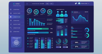
Increase engagement by understanding the psychology of information retrieval & 12 actionable improvements for dashboards
Course Highlights
- Effectively Design Dashboards for a great User Experience
- Increase usage and engagement of the dashboards you create
- Make insights and data more actionable through dashboards that follow best practice Design Principles
- Understand the basis in the psychology of information retrieval
- Understand Key Design principles of Design Theory
- Ability to Critique and improve the design of an existing dashboard
- Coach others in how to design effective dashboards
- 12 Actionable ways you can improve your dashboards
Skills you will learn!
Curriculum
4 Topics
Dashboards as a Communication Tool
Why you need to design for your users
The Psychology of Information Retrieval
Design Principles
3 Topics
Tip #1 - Affordance - Defining your audience and their goals
Tip #2 - Affordance - Defining your title and Subtitle
TIp #3 - Affordance - Designing your Layout
3 Topics
Tip # 4 - Accessibility - Making your dashboards accessible to a range of users
Tip #5 - Accessibility - Adding additional information with notes
Tip #6 - Accessibility - Defining the titles of your Charts
3 Topics
Tip #7 - Aesthetics - Choosing the right Charts
Tip #8 - Aesthetics - Colour themes and Branding
Tip #9 - Aesthetics - Simplifying your dashboards
3 Topics
Tip #10 - Acceptance - The best way to introduce your dashboards
Tip #11 - Acceptance - Maintaining over Time
Tip #12 - Acceptance - Content Management
1 Topic
Summary - Final Words
Design Principles for Effective Dashboard Design


Thank You!
Your review has been submitted successfully.